Graduation Project | Puzzle Game | Game Design | Game Art | 2D Animation | Photoshop | Unity
Overview
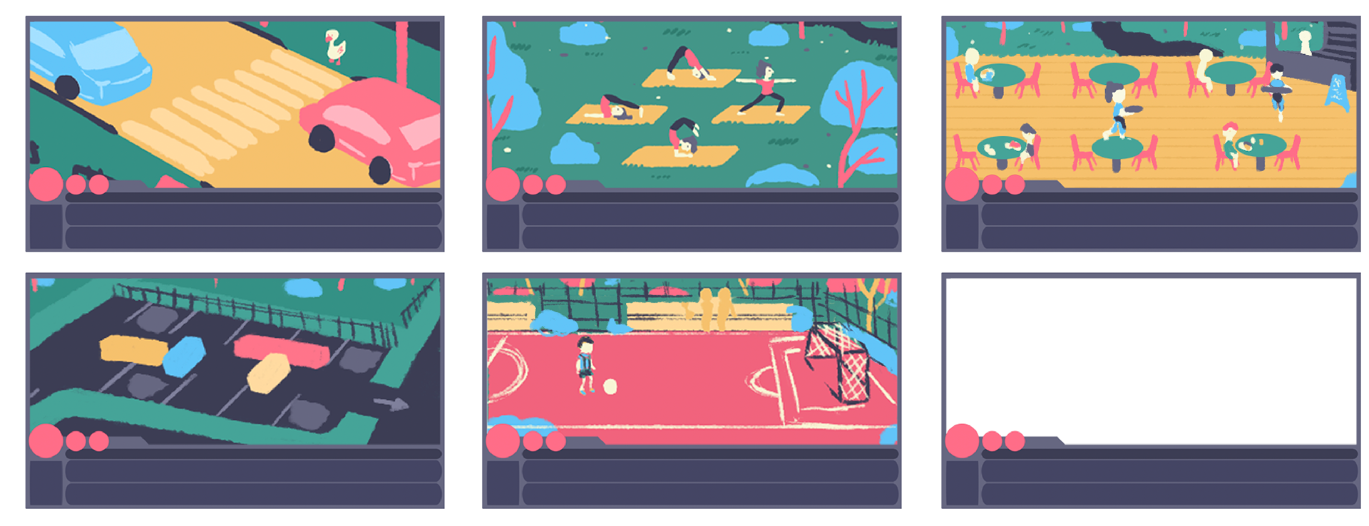
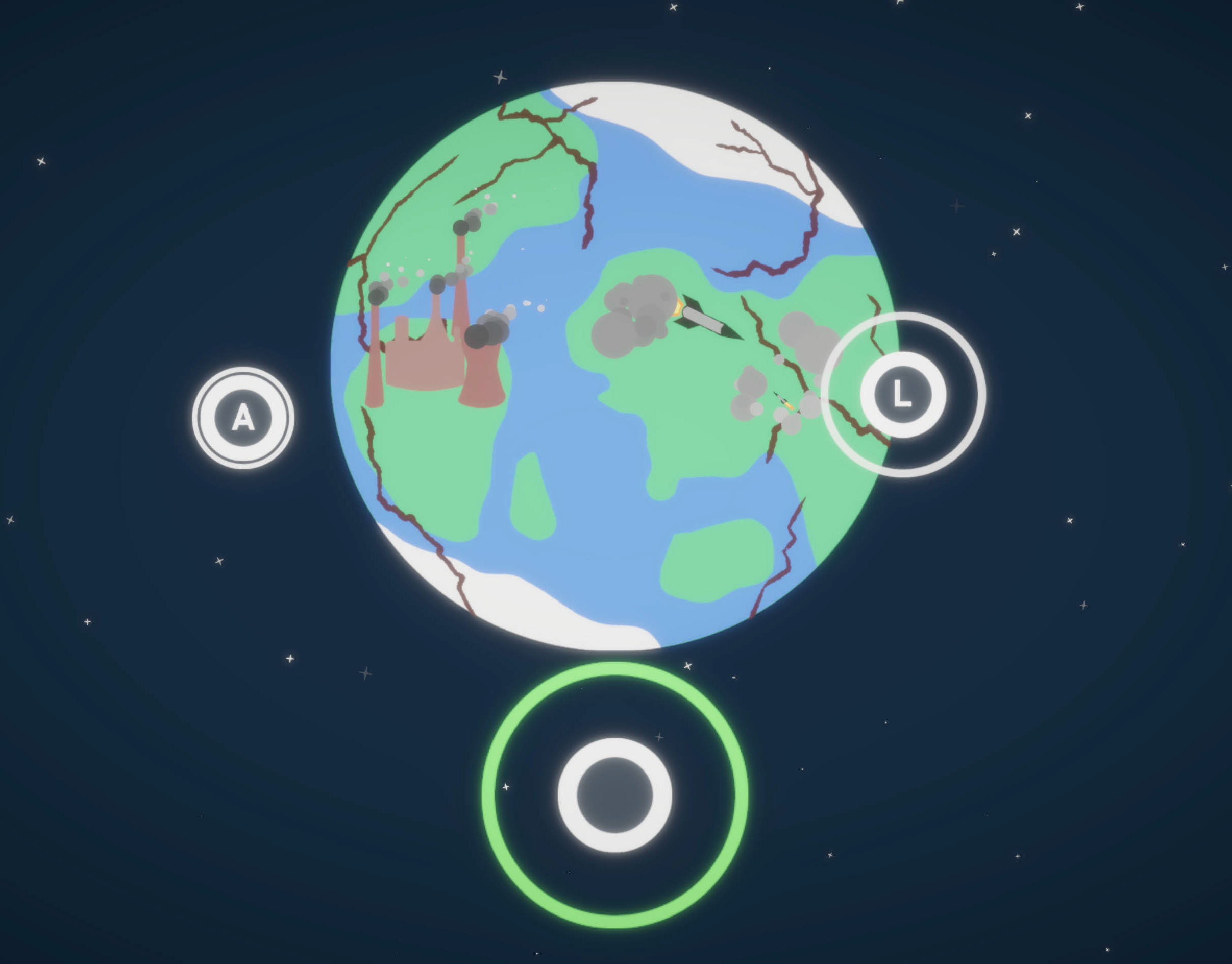
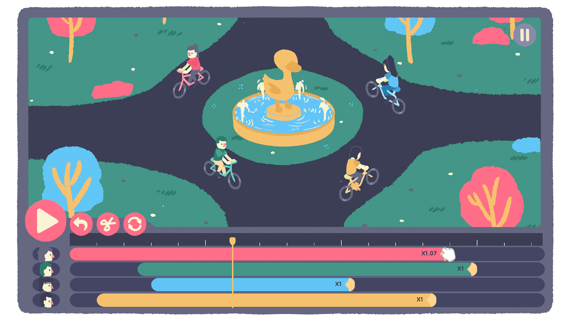
Editor is a puzzle game about reshaping everyday moments that could have ended differently. Through small, precise changes that ripple through time, players shift the entire picture and explore new outcomes — all through the power of editing.
My Role
Art & Animation – Created sketches, polished game-ready art, designed scene compositions, and produced 2D animations. Researched and defined the animation style to fit the game’s tone within a tight schedule.
Asset Integration & Scene Implementation – Integrated all art, animations, and design into Unity. Built and customized each scene in the inspector to match complex code requirements, ensuring smooth functionality.
UX Design – Led play-testing and user testing to refine the timeline tool, making it accessible, intuitive, and user-friendly.
Concept Design – Developed the core “editing gamification” idea, defined the game’s main concept, and shaped the narrative of each scene.
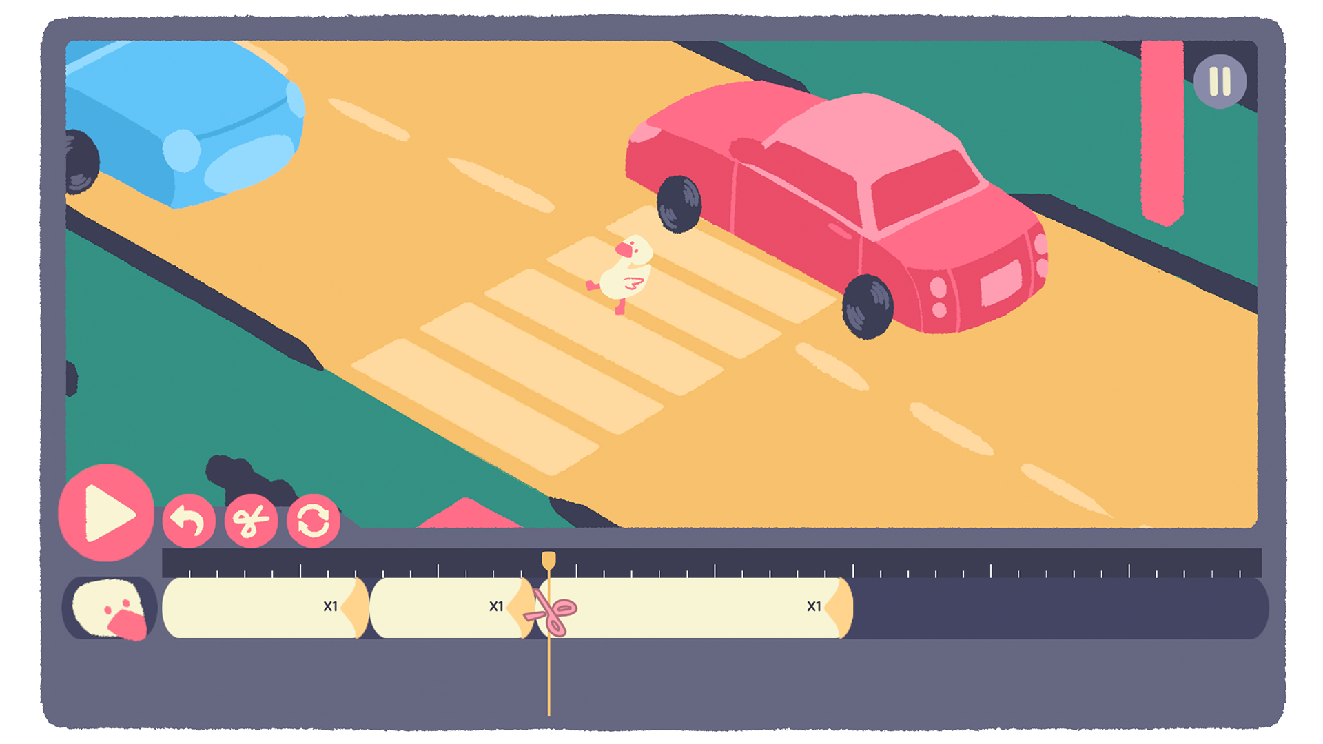
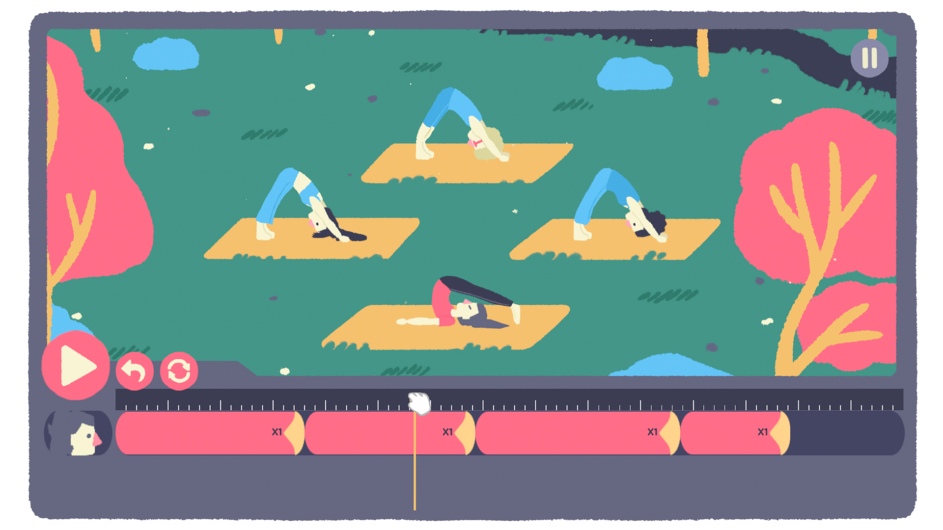
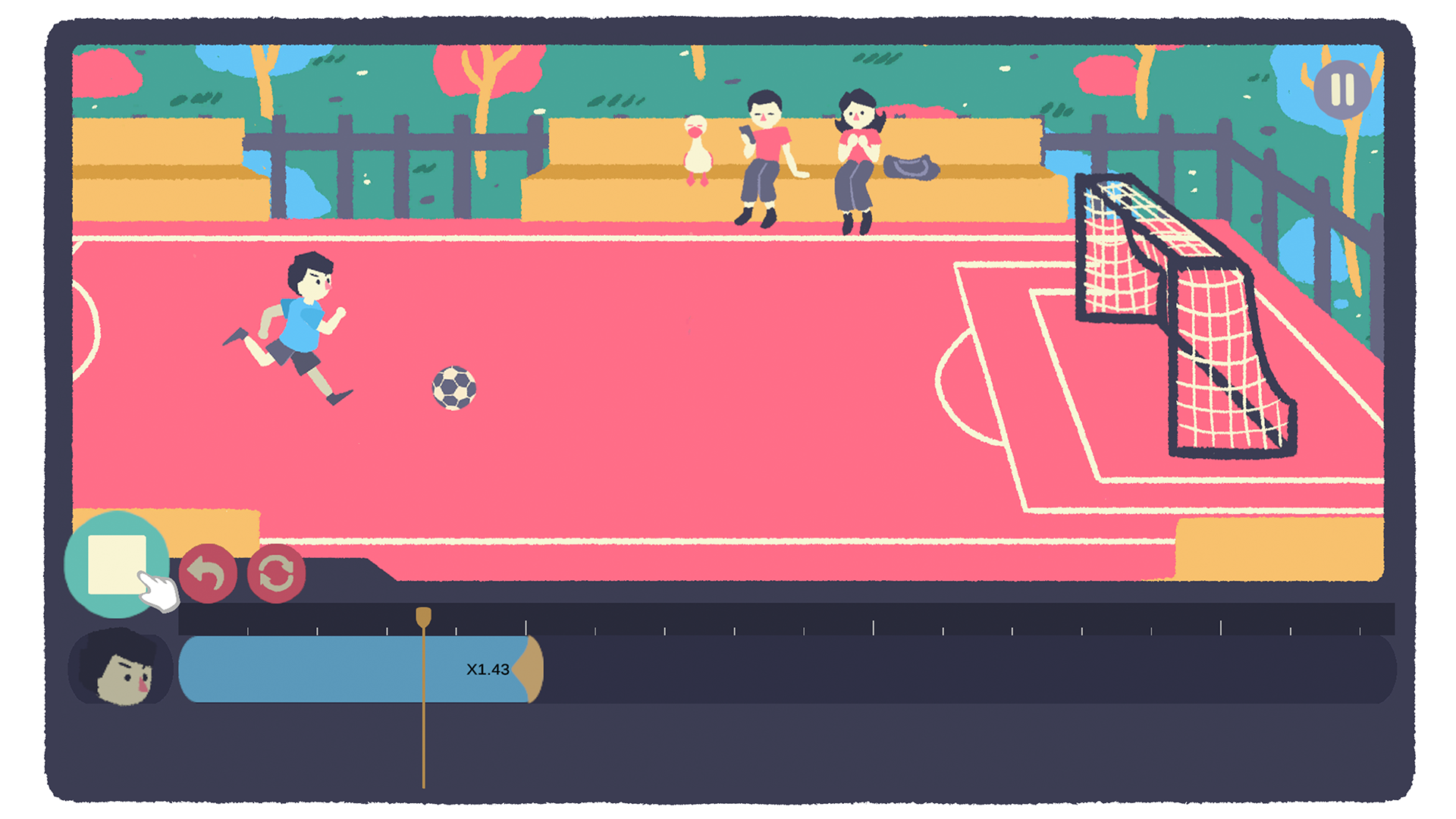
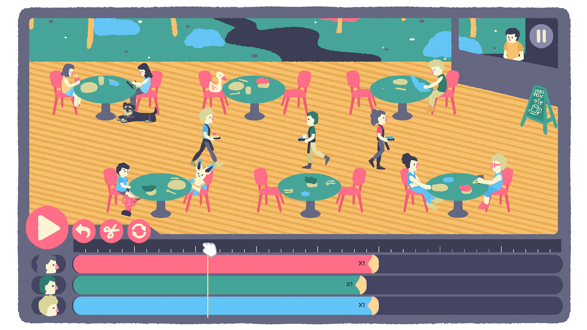
Project Breakdown
Initial idea
Our idea began with a simple question: “What if I chose option A instead of option B?” From there, it grew into exploring butterfly effects—the fragile, everyday moments that can flip upside down depending on even the smallest choices.
In brainstorming with my programming partner, he suggested a puzzle mechanic where players could shift the timing of events in a scene—so outcome A might happen, but with the player’s intervention, outcome B could unfold instead.
As we built the first prototype, we noticed our language naturally drew from the world of editing—terms like “cut,” “timing,” and “number of actions.” That led us to shape the game into a kind of cosmic editor, where the player wields tools to reshape scenarios. This framing opened up a unique creative space, full of potential for playful and thought-provoking ideas.
Timeline Tool Design
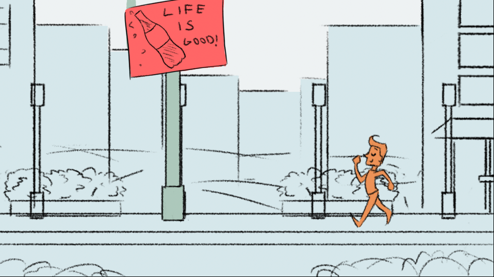
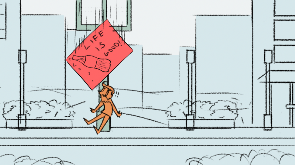
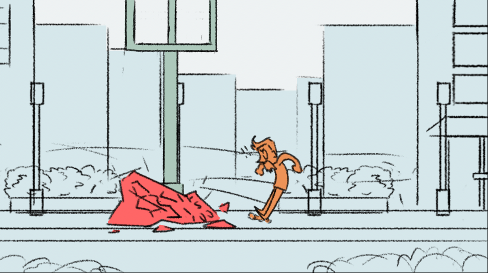
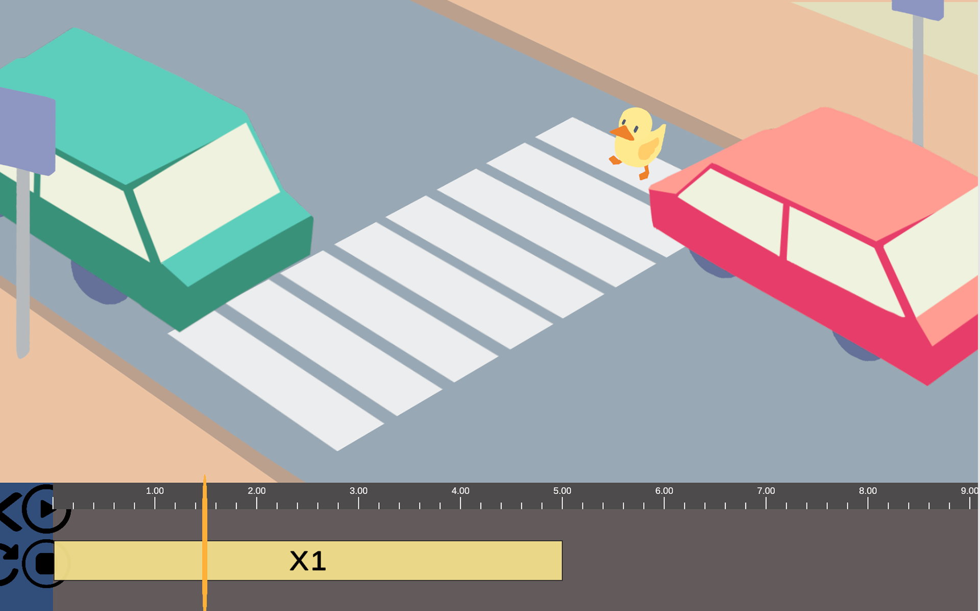
The timeline tool went through multiple iterations, informed by extensive research into existing editing timelines. In my early sketches, I aimed for a minimalist approach. Based on mentor feedback, I shifted the direction toward something more playful — treating the tool like a “toy” for the player: simple, intuitive, even slightly chunky. This made the interface approachable, easy to understand, and engaging to use.
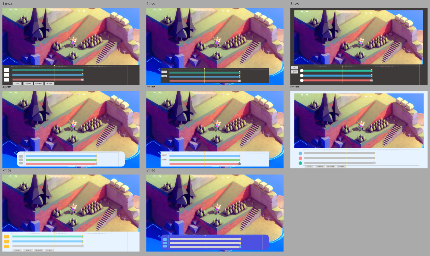
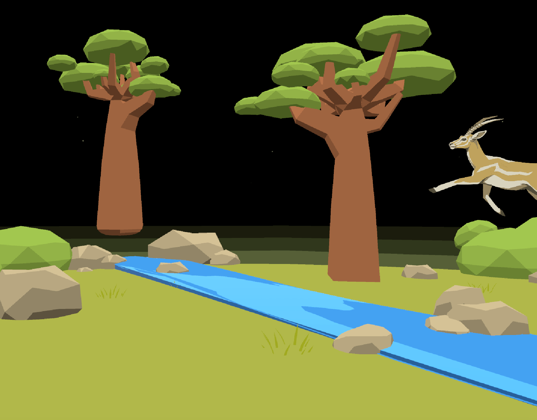
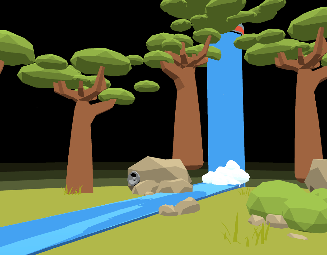
We originally imagined the game in 3D. I’m also a big fan of Tunic, so that’s why it gets a nod here.
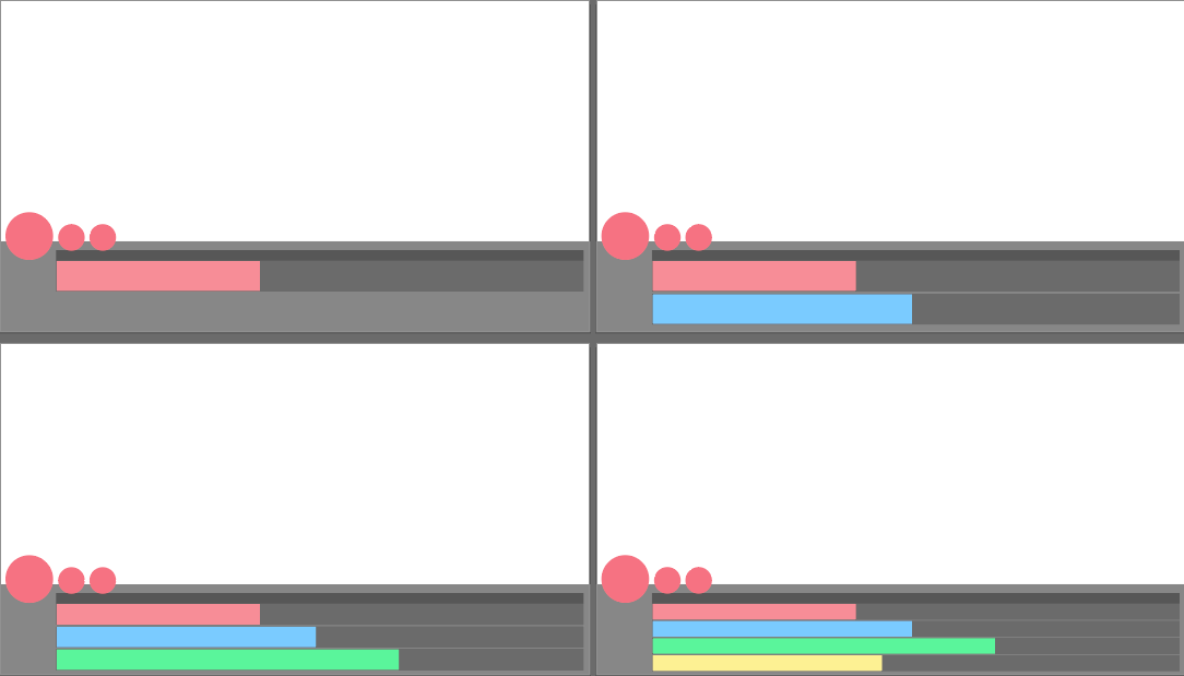
As development progressed, we realized the game would feature different scenes, each with unique actions. To support this, I designed the timeline system to be modular and adaptive. The tracks dynamically adjust in size and layout depending on the number of actions in each scene, ensuring clarity and consistency throughout the game experience.
Artstyle Search
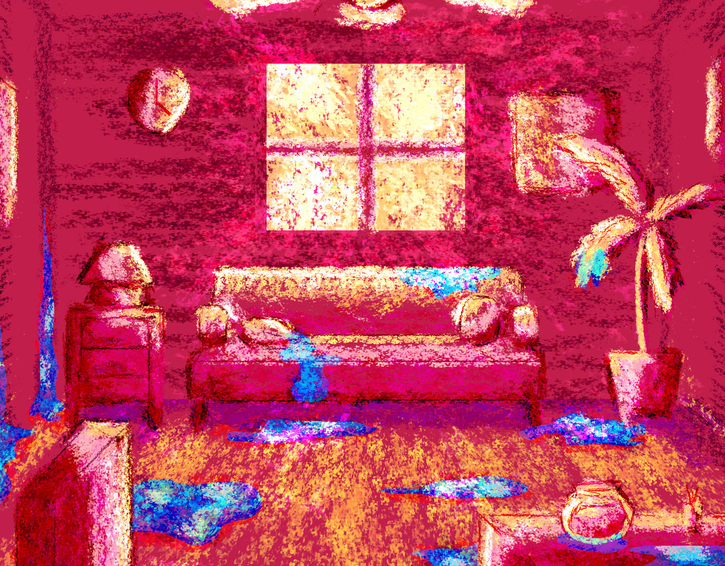
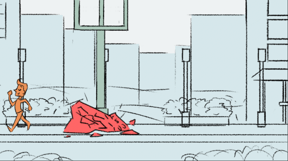
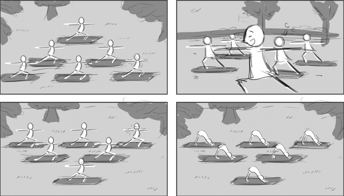
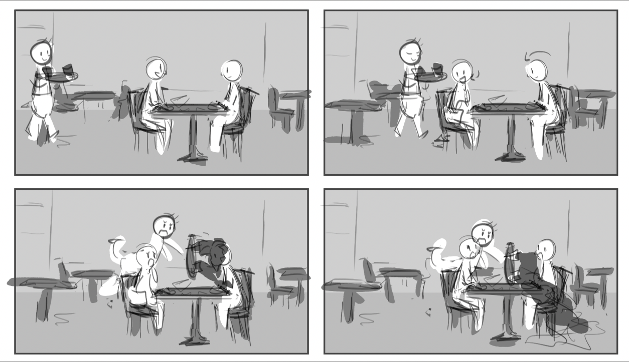
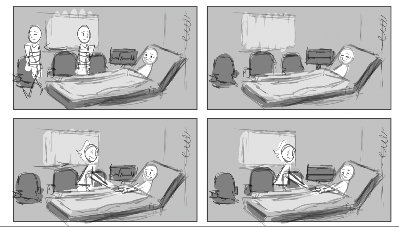
At first, I focused on building the stage layout, prioritizing composition and readability over detailed artwork. The art style was intentionally simple, serving as placeholder visuals for the scenes. However, it quickly felt too generic, and I realized the project needed a stronger, more distinctive visual direction
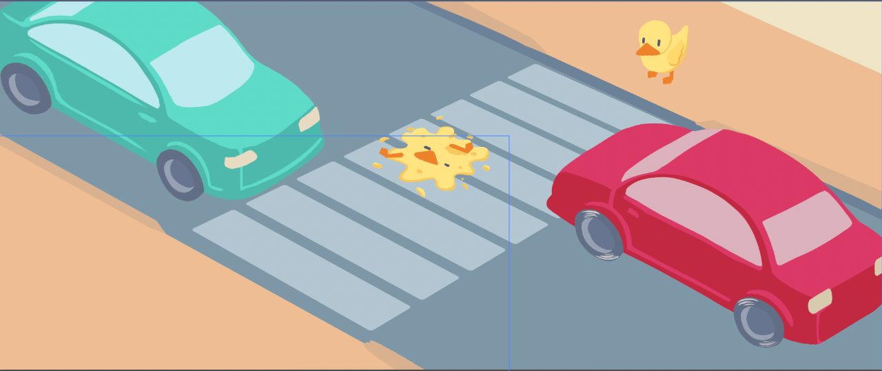
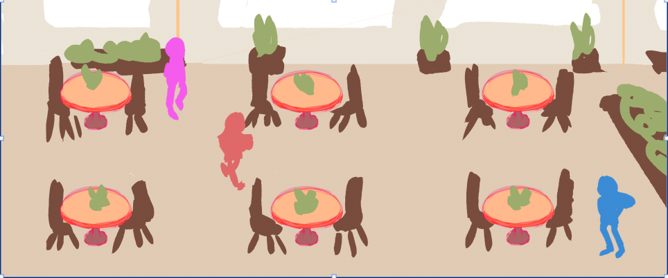
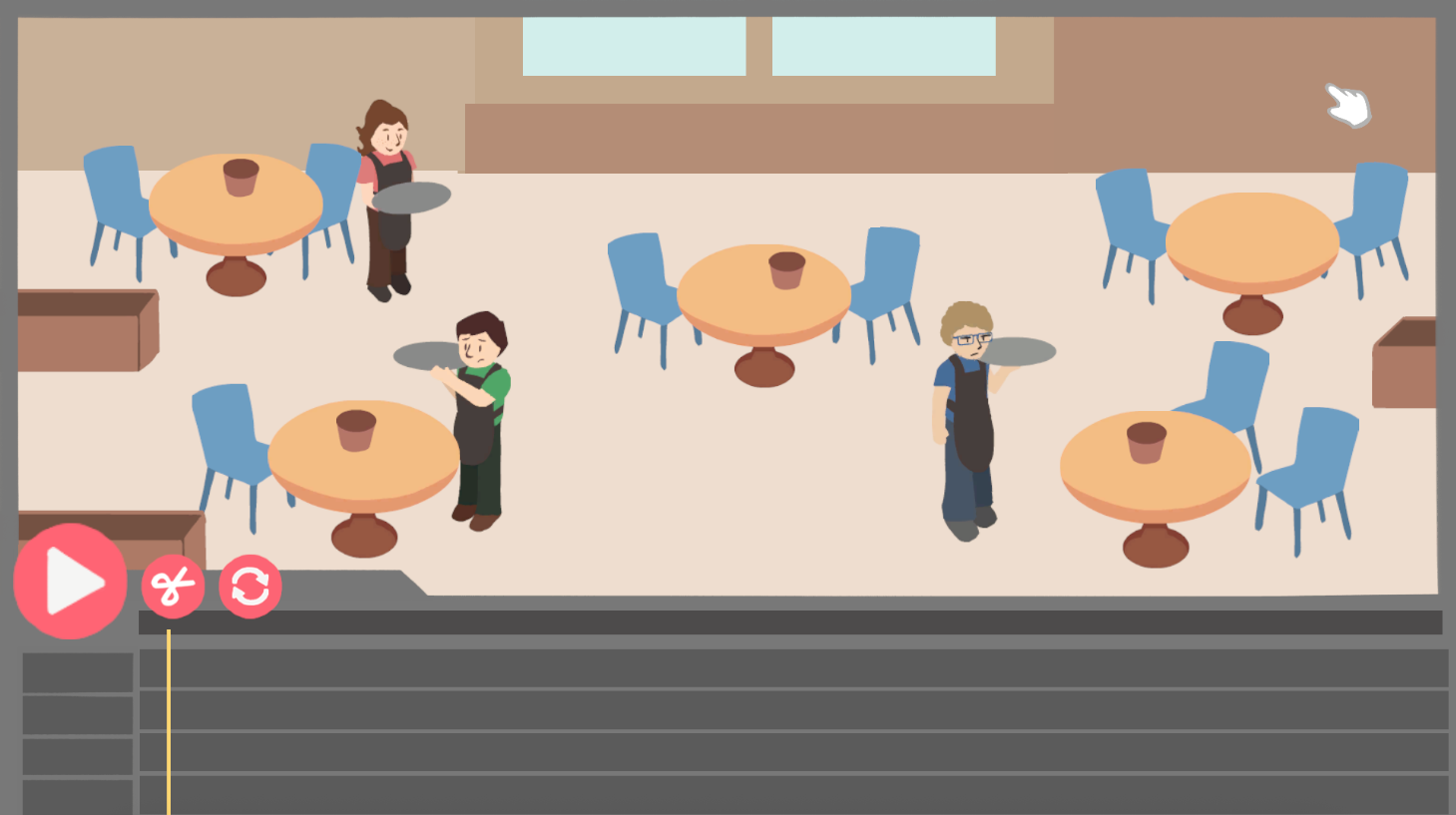
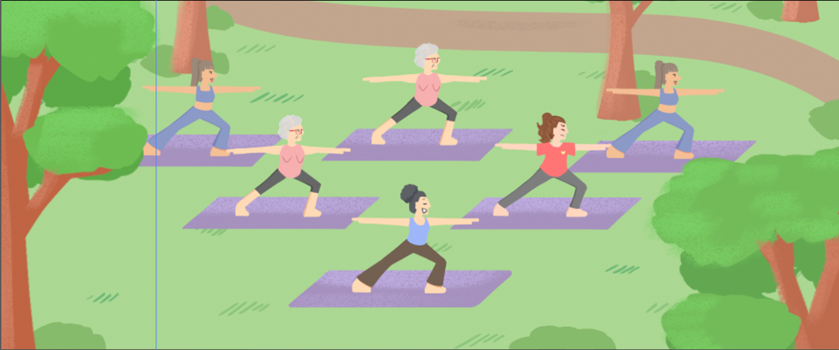
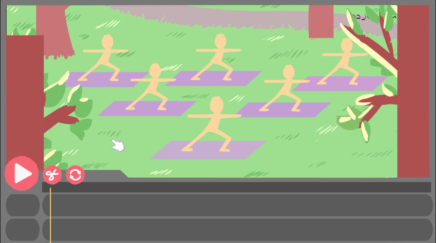
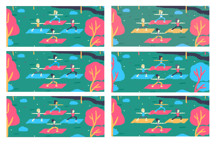
As my focus shifted toward the art direction, I moved away from a “realistic” palette and developed a structured, minimalistic color system. The palette consists of five core colors, each with light and dark variations, allowing flexibility while maintaining a strong visual consistency. By adjusting the percentage of each color per scene (e.g., one scene dominated by green, another by pink).
This palette design process was iterative: I experimented with balance, contrast, and saturation until the system supported both the gameplay readability and the overall art direction.
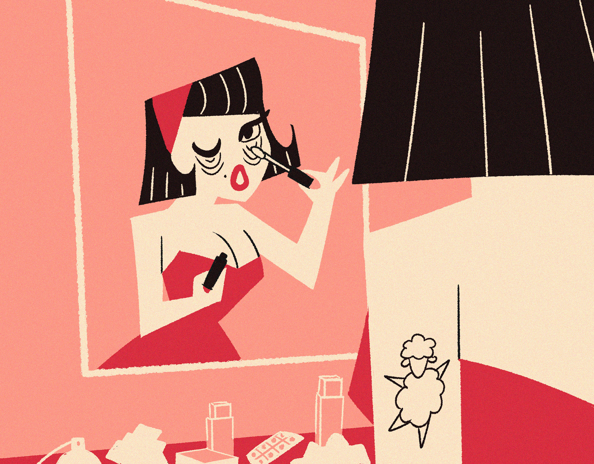
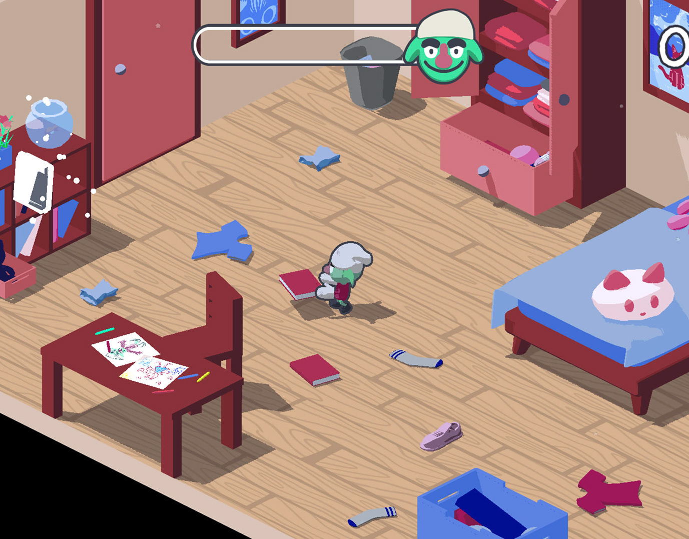
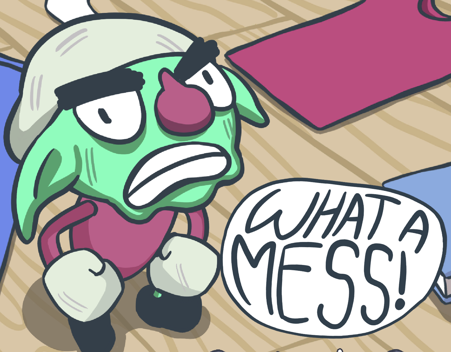
Given that each scene is viewed for only a short time, I chose a flat-color style that emphasizes simplicity and readability. The focus lies on strong silhouettes, clear shapes, and distinct actions, ensuring every scene is instantly recognizable while still maintaining a cohesive minimalistic aesthetic.